A brand evolution for bnUSD
The Balanced Dollar needed a stronger identity. Learn how an “evolution over revolution” approach helped us achieve brand continuity.

If we can avoid a redesign, we will.
After all, what is a brand if not a consistent curation of colours and shapes? A successful brand is the one you’re aware of, and consistency increases brand awareness by 3.5x.
A new identity breaks that consistency. It’s a risk to the brand and it forces people to think. It takes time and conscious effort to relearn, and while most people won’t care, the change will confuse some for a long time to come.
All too often, a rebrand is a pet project to stroke internal egos, or a last-ditch effort to revive a company before it fades into irrelevancy. That’s not the case here.
The truth is, the bnUSD logo left a lot to be desired. A dollar sign taken from the Balanced font Tex Gyre Adventor, it was presented within a ring on the marketing site, naked in the app, and on white backgrounds, it was often devoid of the navy background that gave it any semblance of a brand.
Balanced has a strong, identifiable brand. bnUSD did not.
We’ve known it from the beginning, but it wasn’t a simple problem to solve and priorities were always elsewhere. As we prepared to position bnUSD as a leading cross-chain stablecoin, we realised we couldn’t put it off any longer.
What started as a casual question of “how can we make bnUSD look better in this context?” morphed into a comprehensive review of the design from first principles.
We didn’t redesign bnUSD for the sake of it.
We redesigned it because we knew there was a better solution to the problem.
About the redesign
The goal of our redesign was evolution, not revolution. It would need to capture the spirit of the Balanced brand, but it should look like bnUSD grew up, not like it adopted a brand new identity.
To improve the design of bnUSD, we focused on 3 core elements: shape, colour, and compatibility.
Shape
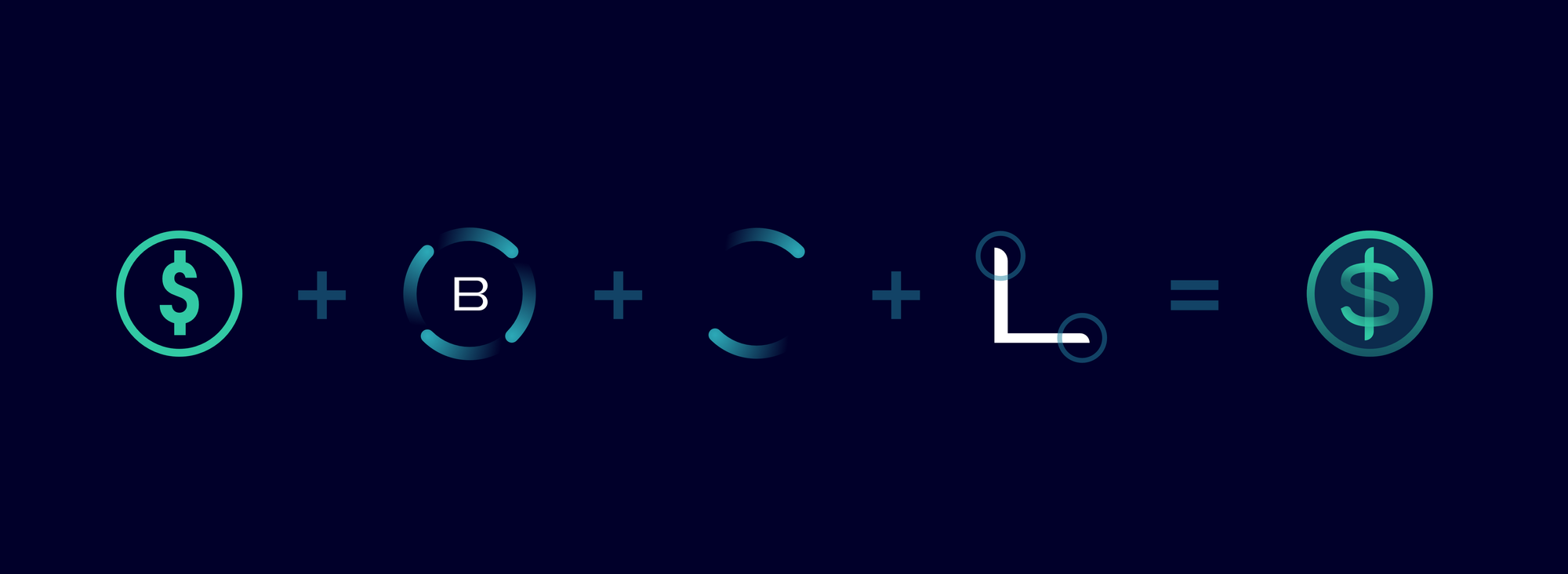
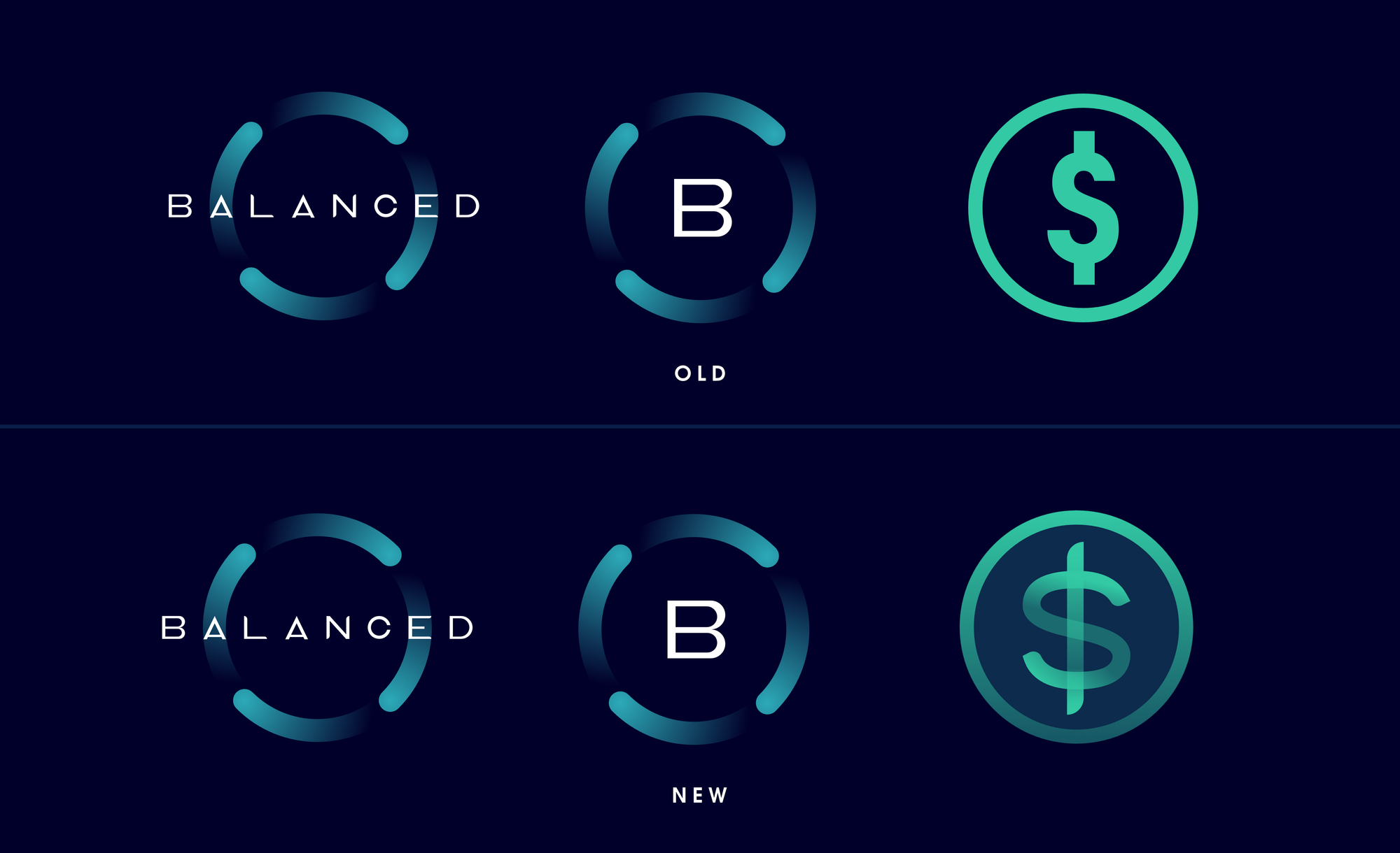
Balanced’s distinctive brand revolves around an orbit design. The BALN logo is contained within the orbits, and as our goal was to tie bnUSD to Balanced as much as possible, surely it made sense to reuse the orbit style here?
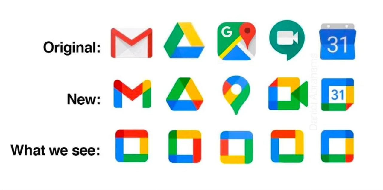
A consistent brand is a strong brand, but sometimes consistency can work against you. Google produced the perfect example: every app in their suite used to have a unique identity. After an attempt to unite them under a single brand style, their logos were so consistent that you couldn’t tell them apart:
In Balanced’s case, the main way to differentiate between BALN and bnUSD would be the shape on the inside, which is harder to do at smaller sizes.
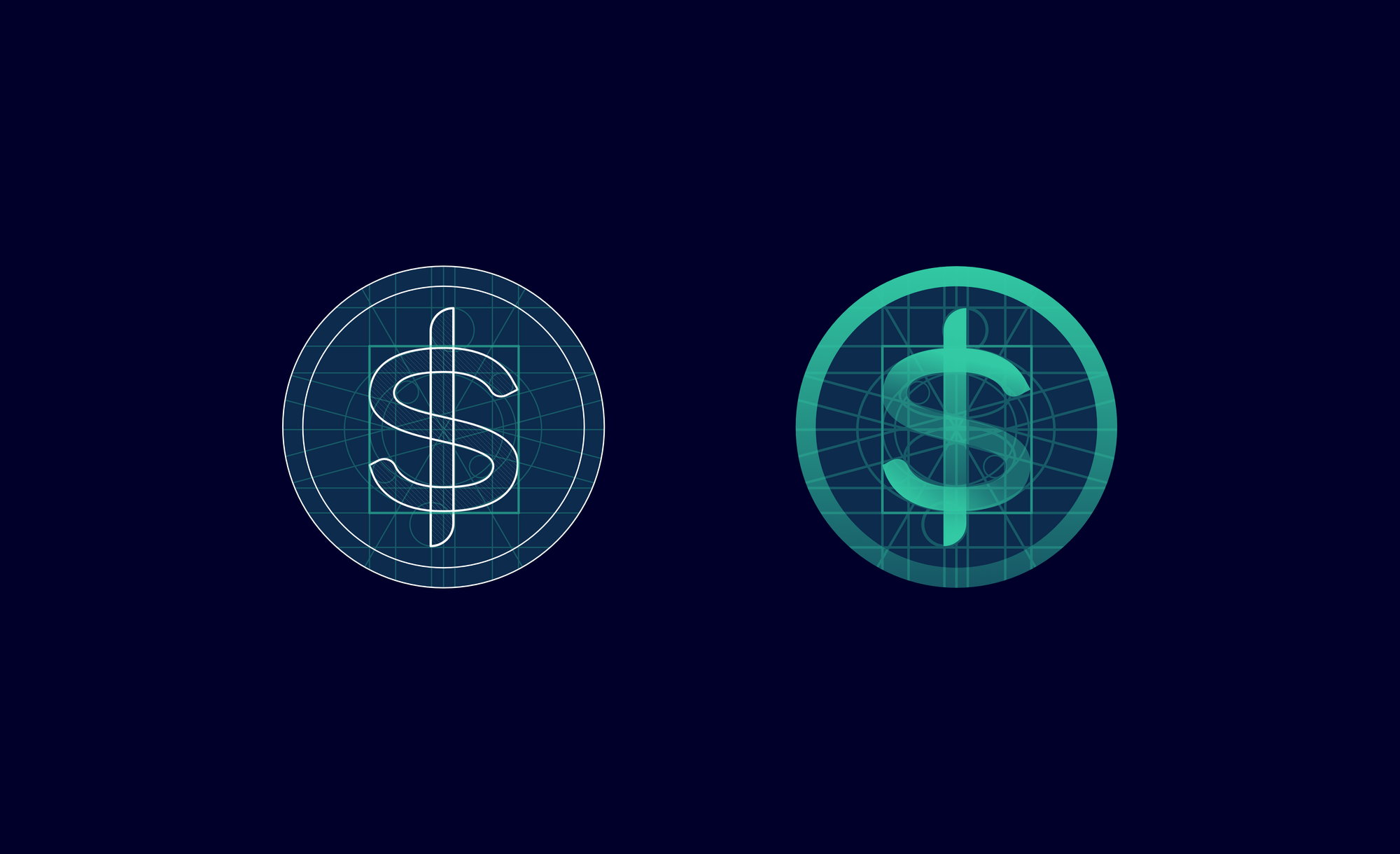
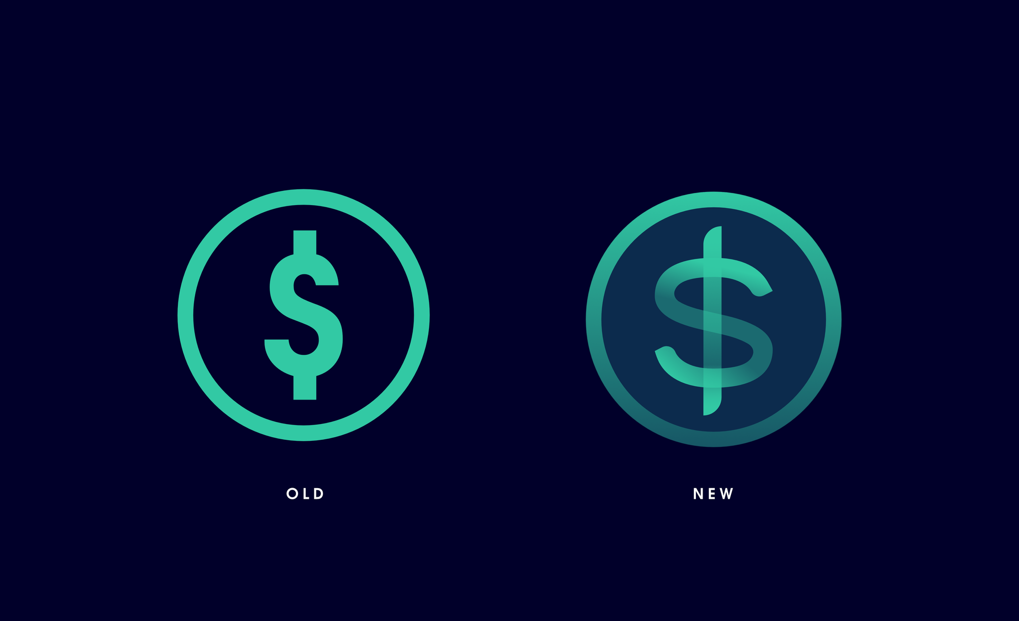
In the end, we decided to incorporate the orbit shape into the curves of the S, playing with the orbit gradient to create the illusion that it’s wrapped around the stem of the dollar sign.
These variations were close, but it still felt like they were missing something.
If you look at the Balanced wordmark, you’ll see that each character includes an asymmetrical finishing point (round on one side, squared on the other):
We decided to apply the same style to the dollar sign. As soon as we did, we knew the shape was complete.
Colour
Those familiar with our work may be aware of our obsession with colour. There’s a simple explanation for this: a signature colour increases brand recognition by up to 80%.
Balanced’s primary colour is turquoise, but bnUSD is green because we expected it to be one of many synthetic assets. Now that bnUSD is Balanced’s only priority, it made sense to reconsider the colour, as well.
But when we applied the standard colour palette to bnUSD, it blended in with everything else — particularly across the marketing materials. Harmonious colours are desirable, but we had to be mindful of the Google Effect.
bnUSD is too important to fade into the background.
We’d already achieved unification of the brand through the core shape, and our goal was evolution, not revolution. So to make bnUSD stand out and achieve continuity between the old design and the new, we decided to keep the original shade of green, which was itself sampled from a range of shades commonly associated with money.
The navy background is consistent, not with the BALN logo but with the panel colour from the app and Stats page. The dark navy didn’t complement the green, and looked too harsh on lighter backgrounds. In a more abstract sense, we also view the Balanced protocol and BALN as the darker base, with bnUSD as the layer on top.
Compatibility
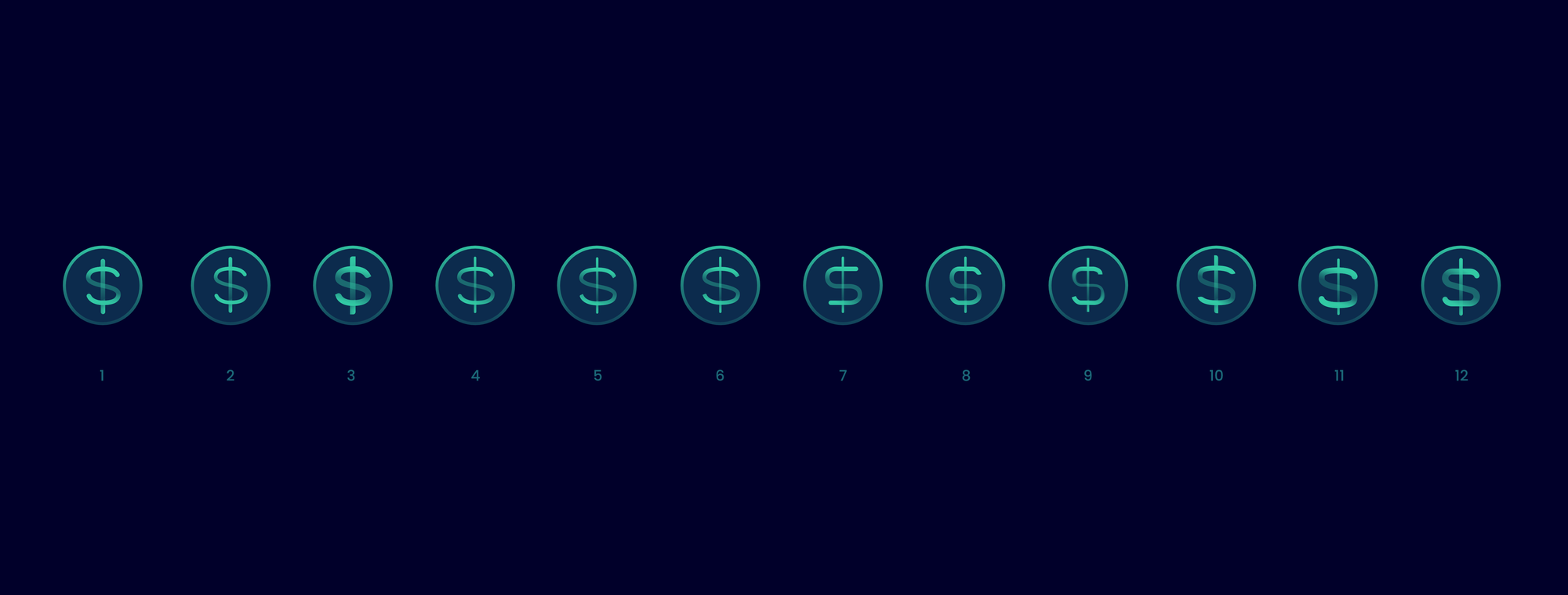
Before we could consider the logo complete, we needed to test it in various scenarios and application formats. Big, small, black and white, alongside other icons, inside graphics both simple and complex, and on third-party sites that lack the context of the Balanced brand.
We also had to review the legibility of glow effects (commonly used in marketing materials), and how well it stood out in a list of currencies now that it had a border to constrain its size (which is why it was borderless in the app before).
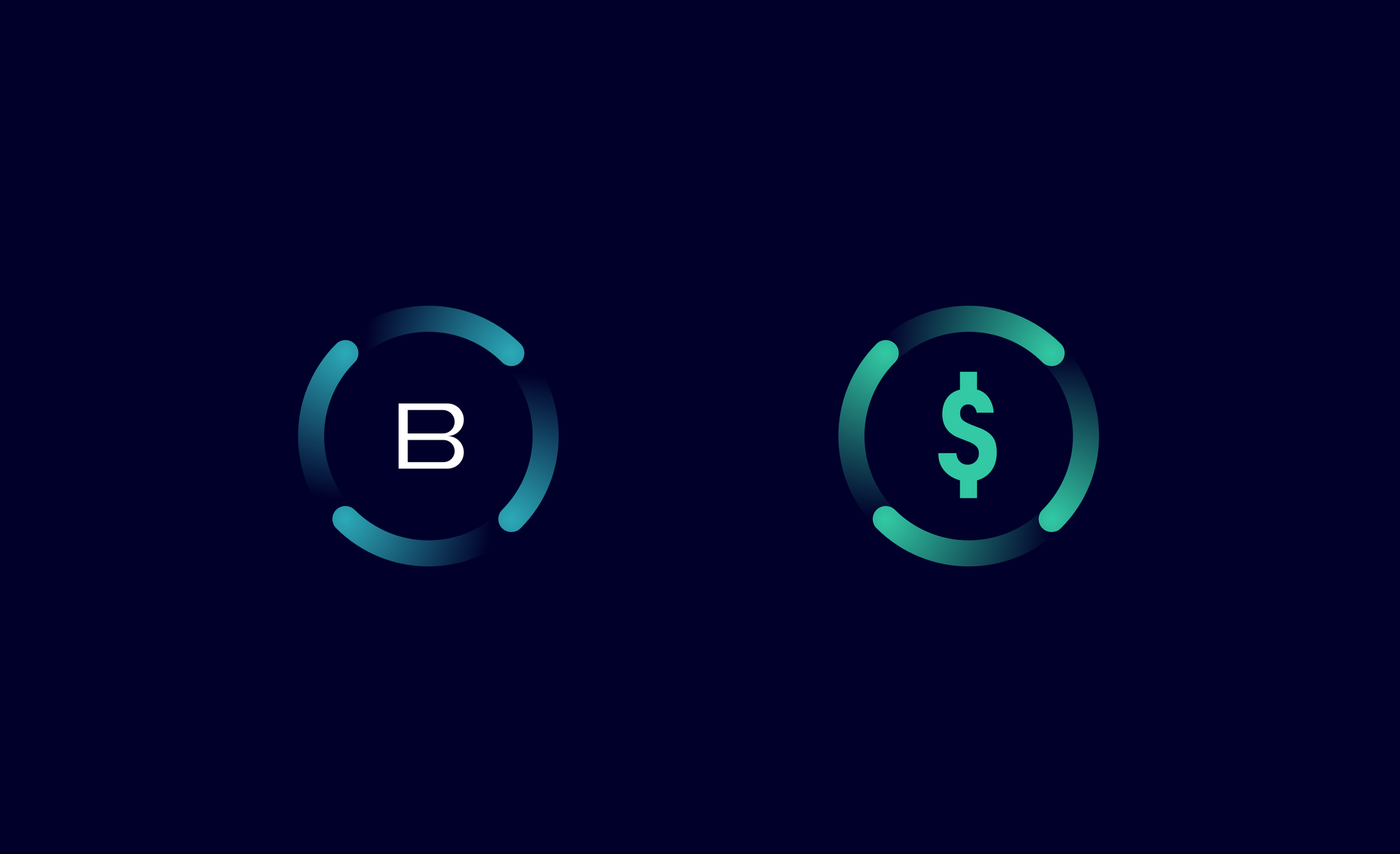
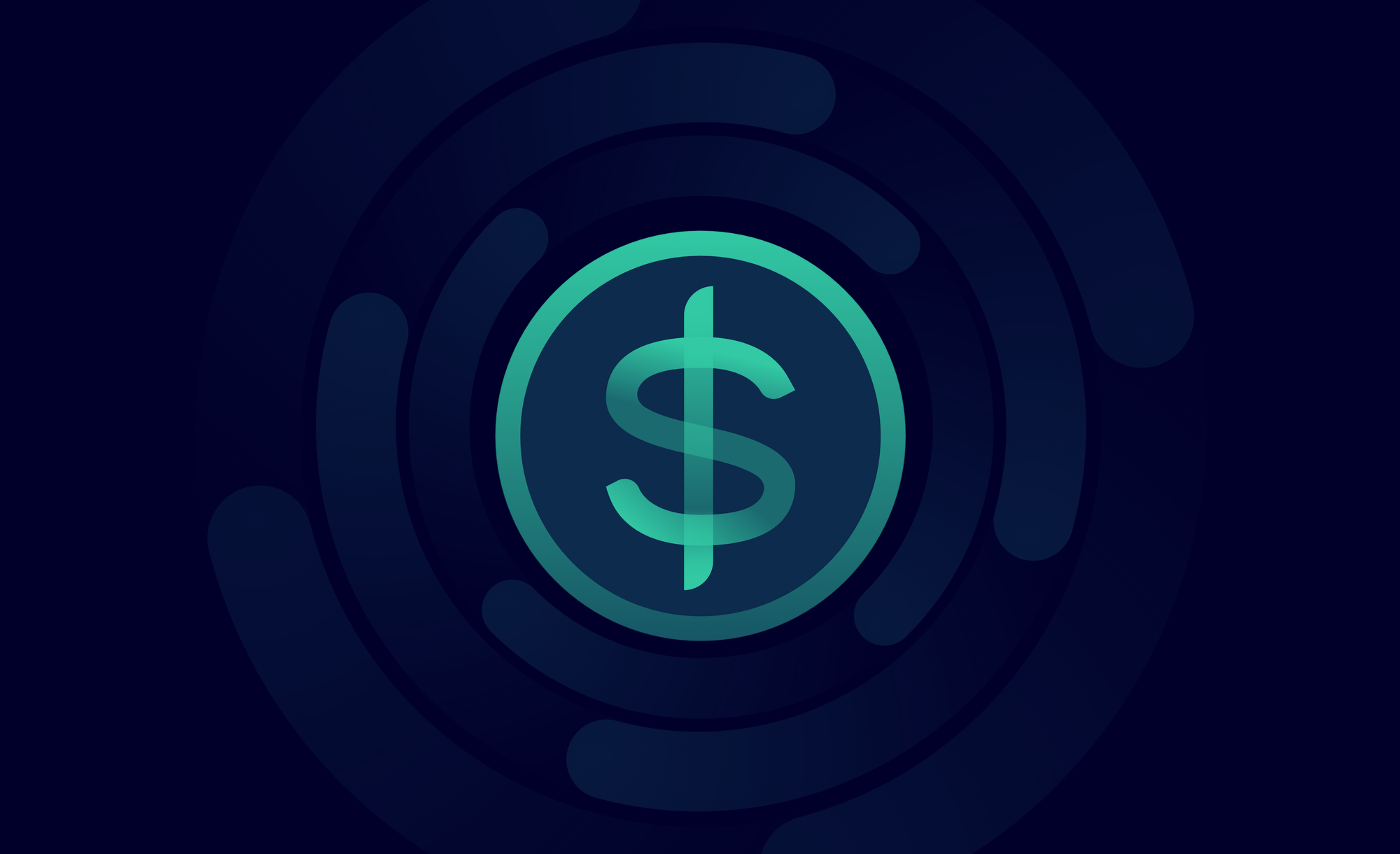
To keep it simple for all involved, we reduced it down to a single full-colour variation which can be used in any setting:
Before vs after
The final design succeeded in putting the old logo to shame, and looks like a natural evolution of the brand. Try the squint test on the comparison image, and you’ll see that the essence of bnUSD remains.
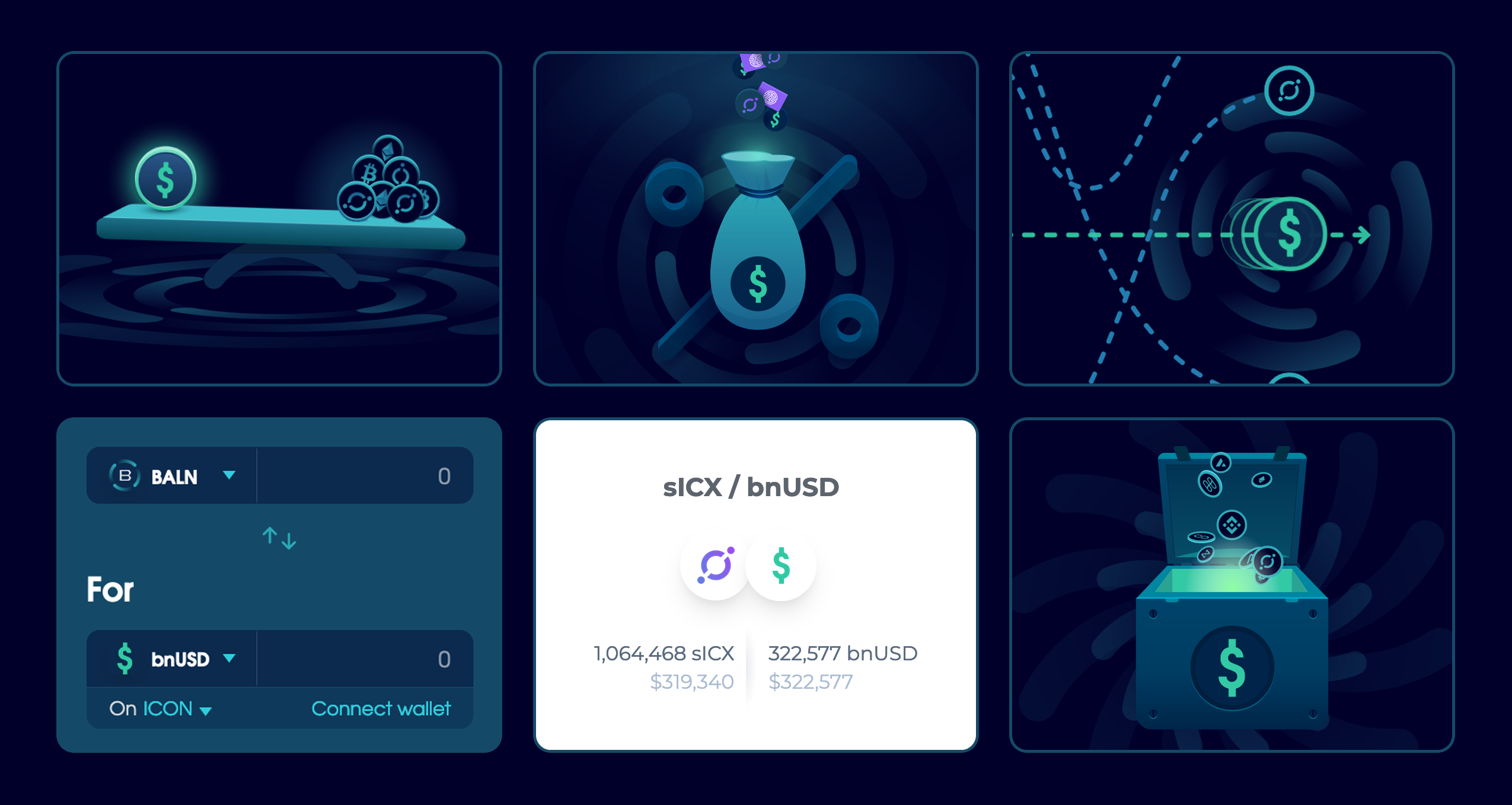
And it now feels much more at home within the Balanced ecosystem:
What happens now?
The bnUSD logo has been updated across the app, Stats page, documentation, and marketing site. Third parties known to use the logo have also been notified of the change.
You can find the bnUSD logo in SVG and PNG formats in the Balanced branding kit (.zip, 4.3MB).
It’s designed to be flexible, so it works just as well on light backgrounds as it does on dark. A black and white option is also included, but should be used as a last resort. No other colours should be used.
For any questions about the new bnUSD design, reach out through the Balanced Discord channel.